Automatic Differentiation Engine
Simple automatic differentiation engine in C++.
<!--
  See https://www.debugbear.com/blog/responsive-images#w-descriptors-and-the-sizes-attribute and
  https://developer.mozilla.org/en-US/docs/Learn/HTML/Multimedia_and_embedding/Responsive_images for info on defining 'sizes' for responsive images
-->

  <source
    class="responsive-img-srcset"
    srcset="/assets/img/1-480.webp 480w,/assets/img/1-800.webp 800w,/assets/img/1-1400.webp 1400w,"

      sizes="95vw"

    type="image/webp"
  >

<img
  src="/assets/img/1.jpg"

    class="img-fluid rounded z-depth-1"


    width="100%"


    height="auto"


    title="example image"


    loading="eager"

  onerror="this.onerror=null; $('.responsive-img-srcset').remove();"
>
</picture>
</figure>
</div>
<div class="col-sm mt-3 mt-md-0">

</div>
<div class="col-sm mt-3 mt-md-0">

</div>
</div>
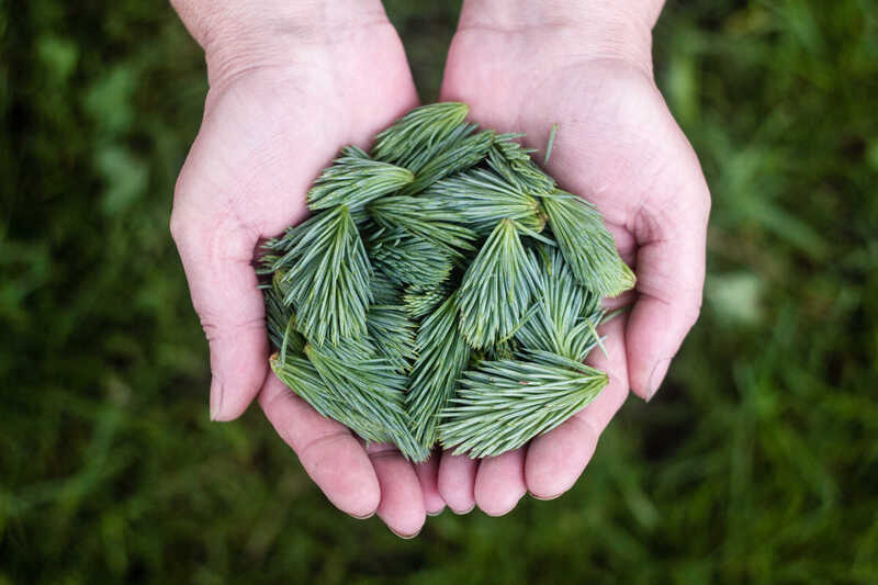
Caption photos easily. On the left, a road goes through a tunnel. Middle, leaves artistically fall in a hipster photoshoot. Right, in another hipster photoshoot, a lumberjack grasps a handful of pine needles.

This image can also have a caption. It's like magic.
You can also put regular text between your rows of images. Say you wanted to write a little bit about your project before you posted the rest of the images. You describe how you toiled, sweated, bled for your project, and then… you reveal its glory in the next row of images.


You can also have artistically styled 2/3 + 1/3 images, like these.
The code is simple. Just wrap your images with <div class="col-sm"> and place them inside <div class="row"> (read more about the Bootstrap Grid system). To make images responsive, add img-fluid class to each; for rounded corners and shadows use rounded and z-depth-1 classes. Here’s the code for the last row of images above:
<div class="row justify-content-sm-center">
  <div class="col-sm-8 mt-3 mt-md-0">
    {% include figure.liquid path="assets/img/6.jpg" title="example image" class="img-fluid rounded z-depth-1" %}
  </div>
  <div class="col-sm-4 mt-3 mt-md-0">
    {% include figure.liquid path="assets/img/11.jpg" title="example image" class="img-fluid rounded z-depth-1" %}
  </div>
</div>
–>